Redesigning Airbnb’s map around local insights, so choosing where to stay in a new city stops being guesswork.
- Context
For my Kleiner Perkins 2024 Fellowship application, I did a case study on a problem that I personally encountered during my study abroad experience in Singapore.
I was accepted into the KP fellowship with this case study.
Introduction
Airbnb has a listing for everywhere. Finding the right one is the hard part, especially in a city you don’t know.
I booked my way around Southeast Asia that year — Bali, Vietnam, the Philippines — and every booking came with the same guesswork. So I took the map feature apart and rebuilt it.
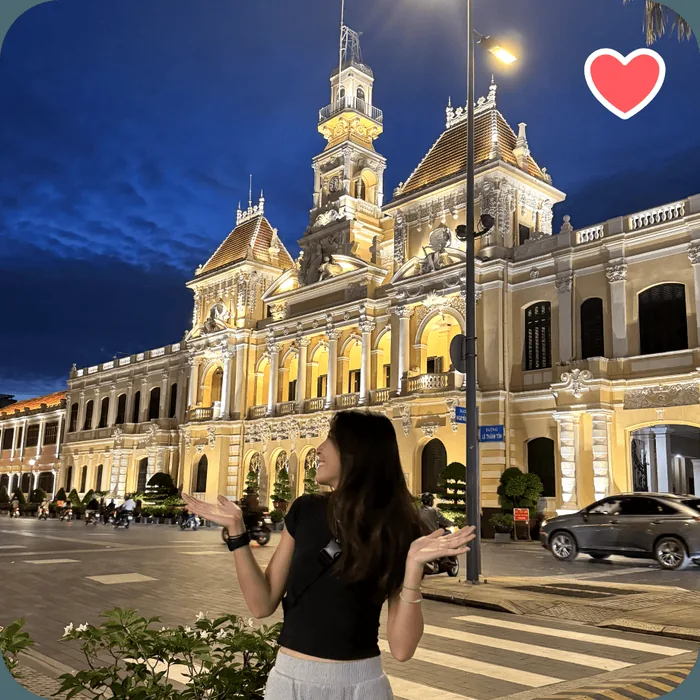 Ho Chi Minh City, Vietnam
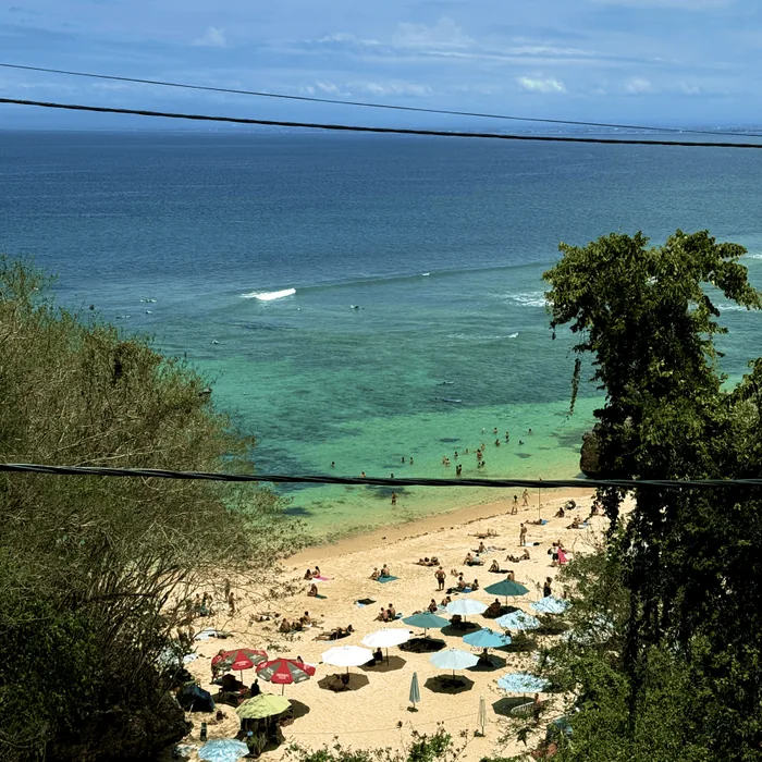 Uluwatu, Bali, Indonesia
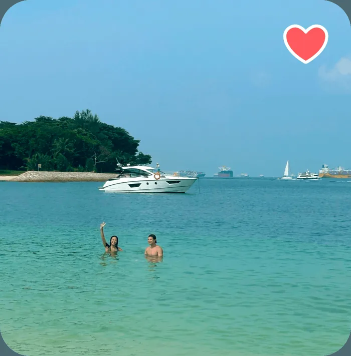 Lazarus, Singapore
Problem statement
Finding the right airbnb in a foreign city is hard.
The same questions came up in every group chat, and the listing page never answered them. Guests book on a guess. Hosts are left describing their whole neighbourhood in a paragraph nobody reads.
- Which area is most popular?
- Is there food near my airbnb?
- How will we get around the city?
- Is this neighborhood safe?
User analytics
Users book through Airbnb for authentic local experiences.
People come to Airbnb to live somewhere rather than stay somewhere — and then get almost nothing about the somewhere.
- 59%of Airbnb users are 25–44Source: Search Logistics
- 77%choose Airbnb to live like a localSource: Search Logistics
Qualitative research
There are two types of users: research-oriented and spontaneous.
Five interviews, all Airbnb regulars aged 25 to 44. Two profiles came out of them: research-oriented users, who go off to other apps to vet a neighbourhood, and spontaneous users, who book on instinct and find out where they are on arrival.
How do you currently find local insights about an area where you’re considering staying? Have you faced any challenges in this process?
“I usually end up searching on google maps or TikTok. It can be a hassle because I have to go to multiple apps to find this information.”
Can you share a specific instance where lack of local insights impacted your stay or experience in a destination?
“Once, I stayed in a perfect Airbnb, but it turned out to be quite far from lively areas and didn’t feel very safe at night.”
Quantitative research
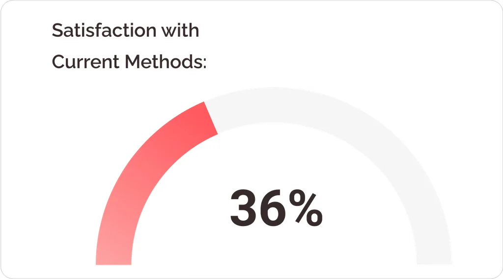
Both types of users want better methods to look for local insights.
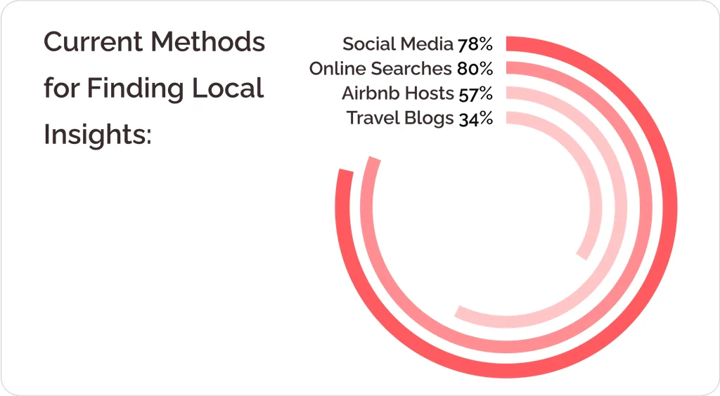
Then a survey of 200 people. Only a third were happy with how they find local information today, and most of them were doing it somewhere other than Airbnb.
Affinity map
Users want more information regarding neighborhoods in foreign cities.
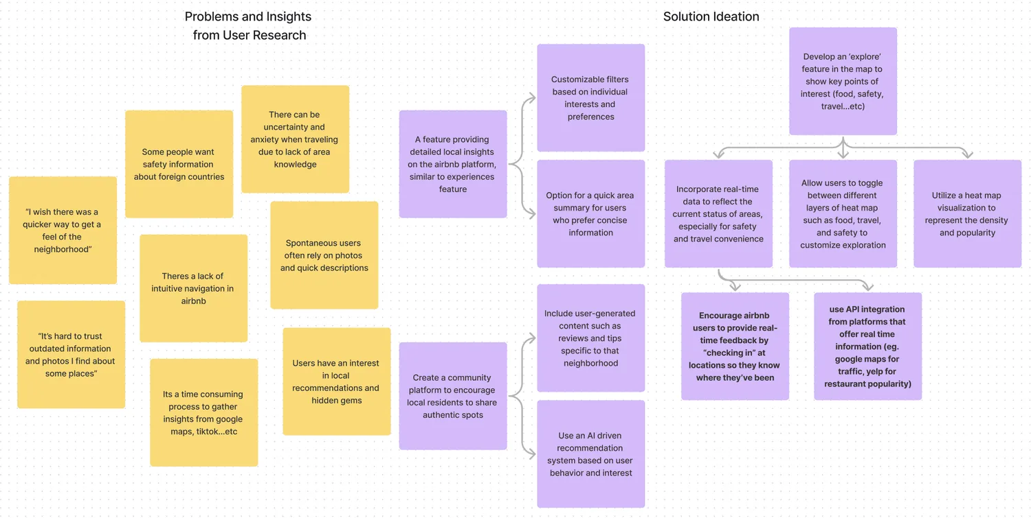
Mapping it all out, one gap ran through everything: people want to know what’s around a listing, and the map is the obvious place to tell them.
Goals
Optimize Airbnb’s interface with local information for improved decision-making.
Put the local knowledge in the map itself: faster decisions for guests, better-matched guests for hosts.
Business impact
Retention. An easier search keeps people looking rather than leaving.
Revenue. More time on the map means more bookings.
User impact
Less decision fatigue
Less time wasted searching on third-party platforms
More local gems discovered
Better travel itineraries
Ideation
How can we enhance Airbnb stay selections by providing comprehensive local neighborhood insights?
Approach 1
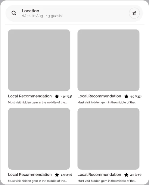
A local insights feed
Access hidden gems through a local insights feed recommended and verified by airbnb hosts.
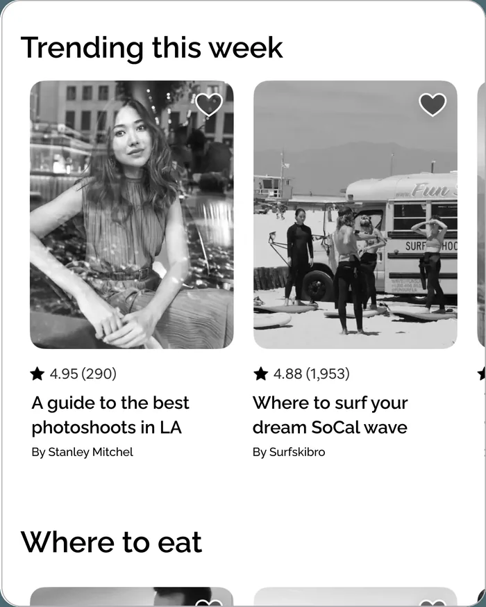
Approach 2
Community Spot Sharing
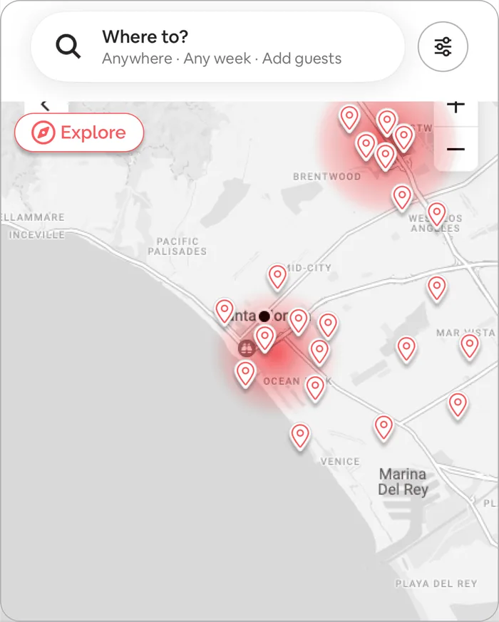
Discover key attractions and insights at a glance with an intuitive, map-integrated exploration tool.
Approach 3
Explorer Mode
Discover key attractions and insights at a glance with an intuitive, map-integrated exploration tool.
Approach 3 won: a heat map of where the good stuff is, with preview cards to browse it. It serves the planner and the improviser with the same screen.
App audit
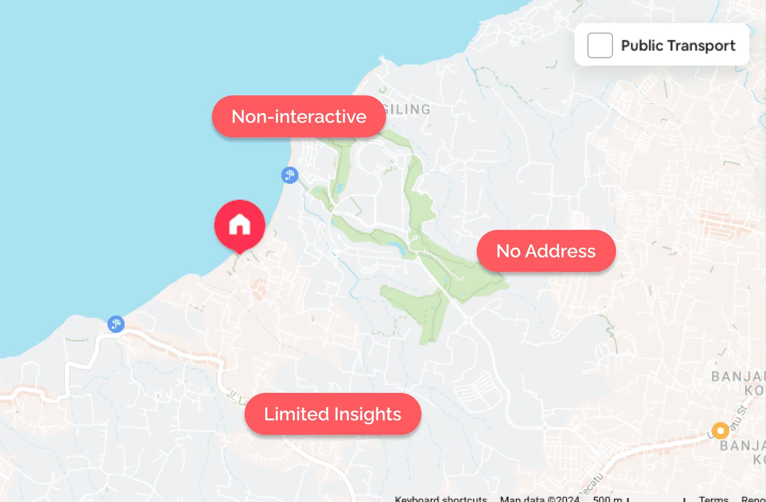
The Airbnb map feature is limited.
The map today barely responds and tells you almost nothing about where you would be staying.
User testing
Gaining feedback from the community.
Five people used the prototype. Three things came back:
Finding 1
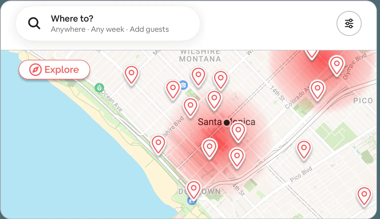
The red color on the heat map reminds users of danger.
Red reads as danger. The gradient needed to say density, not risk.
Finding 2
The map looks visually cluttered.
Too many pins at once. Nobody could focus on the one thing they cared about.
Finding 3
Information feels out of date.
No live data and no distances, so people didn't trust what they were looking at.
Final solutions
Key features of ‘Explorer Mode’
Each one answers a finding.
Feature 01
Local Insights Density Heatmap
A heat map of local attractions and eateries, so you can see at a glance which neighbourhoods have something going on.
Feature 02
Insight Type Filter Categories
Dining, transportation, attractions, safety — filter the map down to the one thing you're actually asking about.
Feature 03
Live Data and Navigational Map Directions
Live crowd levels and directions to each place, so the information holds up on the day.
Measuring success
Measuring results through ‘Explorer Mode’
I don’t work at Airbnb, so this is what I’d watch:
- Bookings that start with a map interaction
- Retention of Explorer Mode users against everyone else
- Time spent in the map, before and after
Reflection
I wanted to fix half the app. Scoping it down to one problem, over several rounds, was most of the work — and the part I learned the most from.
For next time…
- Improve ‘Explorer Mode’ search and discovery with themed filters.
- Enable offline map access for seamless navigation without internet.
- Promote sustainable travel by highlighting eco-friendly options.
Moving forward…
Keep testing it, keep cutting it back, keep travelling.
Travel bucket list
 Great Barrier Reef in Australia
 Northern Lights in Iceland
 Surfing in Fiji Islands