
Revamping the profile page and onboarding flow to boost user conversion and retention to reduce the learning curve and introduce a more personalized experience.
ROLE
Product Designer
TOOLS
Figma
Google Forms
TIMELINE
March 2024
Skip to Prototype
INTRODUCTION
Connecting people through their favorite entertainment.
Artics is a japanese-born social media startup aimed to build an interest-based community for young people in the US to discuss their passions and interests in various entertainment forms.
It is a part of globally recognized accelerators such as Techstars and Plug and Play, and has been featured on the Forbes 30 Under 30 list.
Although artics has successfully launched a MVP in Japan, its mission is to create more impact and community in the American market.

PROBLEM STATEMENT
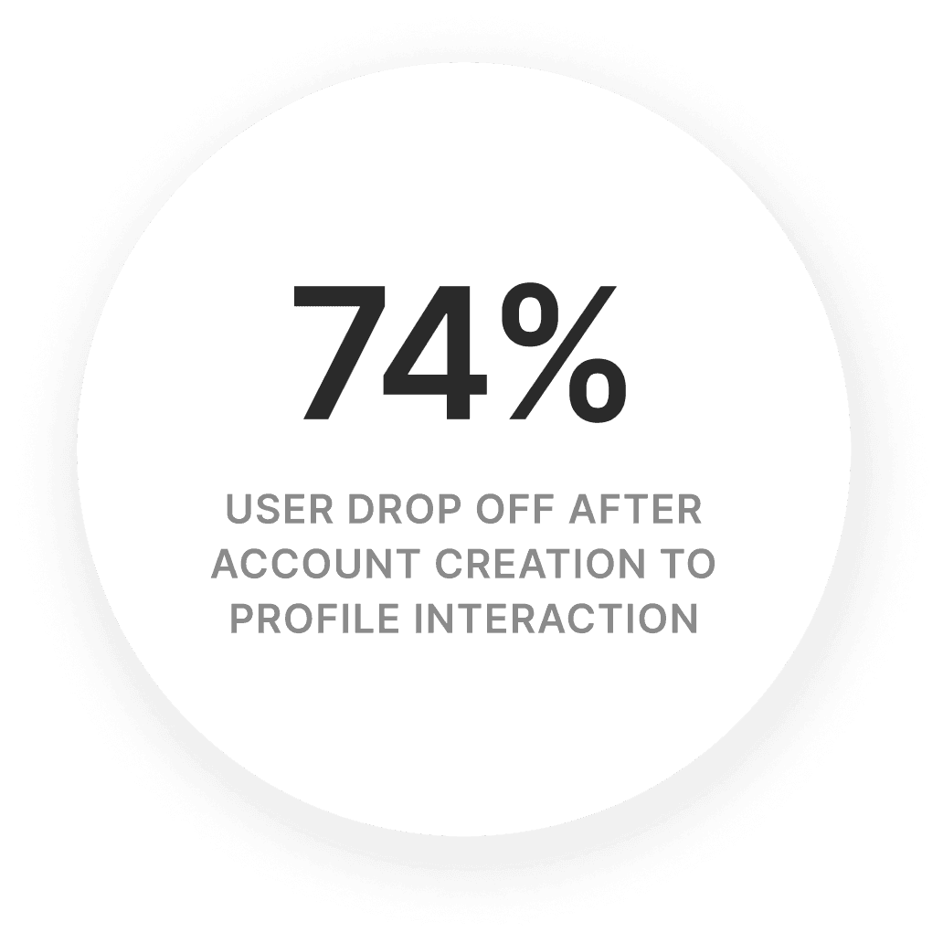
There is a high user drop-off rates after download with minimal profile page interaction.
During the initial stages of product testing, we introduced the product to various American high schools to receive immediate and objective feedback.
Although download rates were high, many users dropped off after creating an account and did not customize their profile or add interests.
After onboarding, users are directed to the profile page, and that was main drop-off point in the flow.
RESEARCH
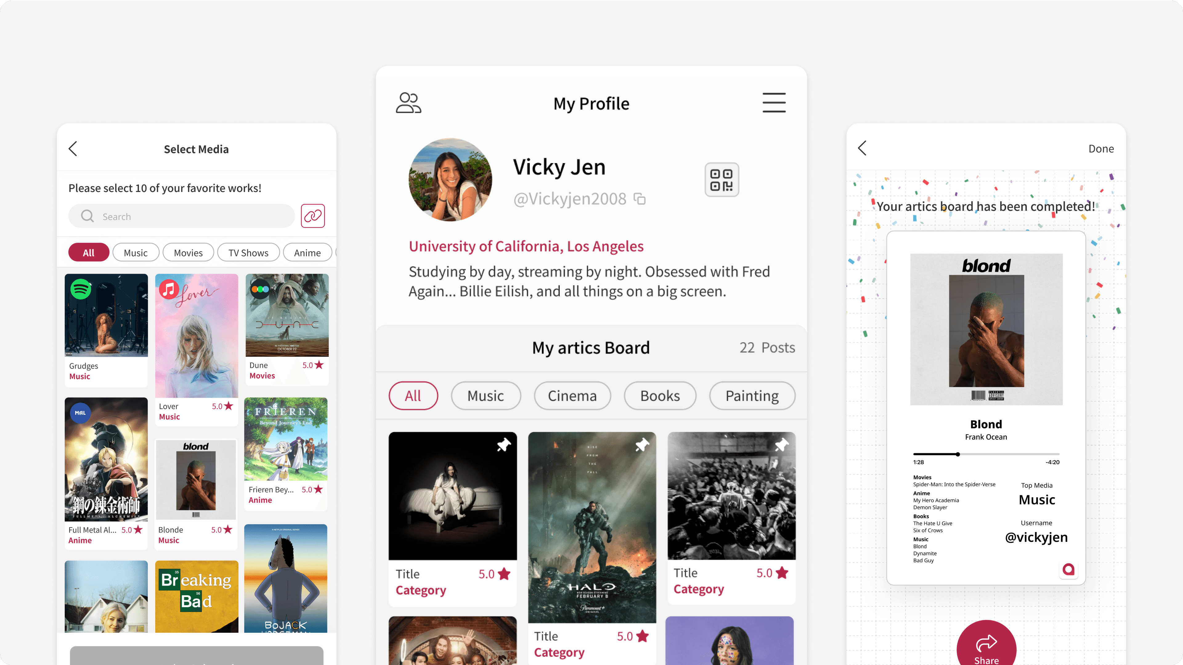
Existing profile page interface
As a platform meant to foster conversation about peoples interests, the existing interface avoided numeric stats like likes and follower counts to reduce social pressure and encourage authentic interactions.


QUALITATIVE USER RESEARCH
User pain points
After conducting user interviews with existing artics users, two main pain points were revealed.

CULTURE ANALYSIS
Japanese vs United States social media interfaces are different.
When Artics launched in Japan, users didn't report issues with the interface. To dig deeper on this topic, my research revealed some distinct differences between Asian and Western product interfaces. Below are my findings:
ASIAN
Versatile and multi-functional
Asian UIs feature multiple calls to action to meet varied user needs. They emphasize versatility, with vibrant colors and dense layouts to maximize functionality.
WESTERN
More simple and minimalistic
Western UIs focus on one primary call to action, guiding user behavior. Designers prioritize user focus and navigation ease, creating intuitive and easily readable interfaces.
CHALLENGE + SOLUTION
How might we adjust the product to better fit the US market through design?
With the profile page being the main drop-off point, I came up with two solutions tackling the interface design and profile personalization to boost engagement.
CHALLENGE
How can we reduce the learning curve?
SOLUTION
Profile interface redesign to match industry standards
CHALLENGE
How can we introduce user-directed features for a more personalized experience?
SOLUTION
Introduce ‘artics board onboarding’ to improve the initial profile setup experience
GOALS
Optimize Airbnb's interface with local information for improved decision-making.
My key design goal is to streamline Airbnb's interface and enrich it with accessible local insights, simplifying user decision-making process, boosting platform engagement and satisfaction.
For guests, the aim is to enable faster and more efficient discovery of suitable accommodations, ensuring quick access to detailed local insights for making more informed booking decisions.
For hosts, the focus is on improving property visibility through enhanced functionalities and attracting guests whose preferences align with what the property offers.
Business Impact
Increased User Retention
Simplifying discovery with the map feature encourages users to stay longer and return, reducing drop-offs.
Revenue Growth
Improved map engagement leads to more bookings, directly increasing Airbnb's earnings.
User Impact
Less decision fatigue
Less time wasted on searching on third-party platforms
More local gems discovered
Better travel itineraries
IDEATION
How can we enhance Airbnb stay selections by providing comprehensive local neighborhood insights?
Approach 1
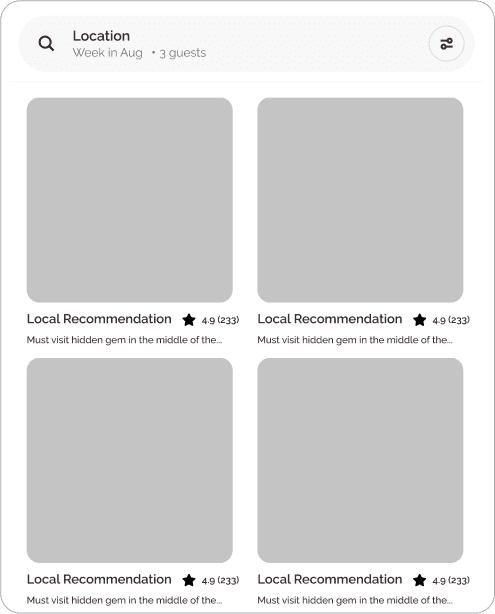
A local insights feed
Access hidden gems through a local insights feed recommended and verified by airbnb hosts.
Approach 2

Community Spot Sharing
Discover key attractions and insights at a glance with an intuitive, map-integrated exploration tool.
Approach 3

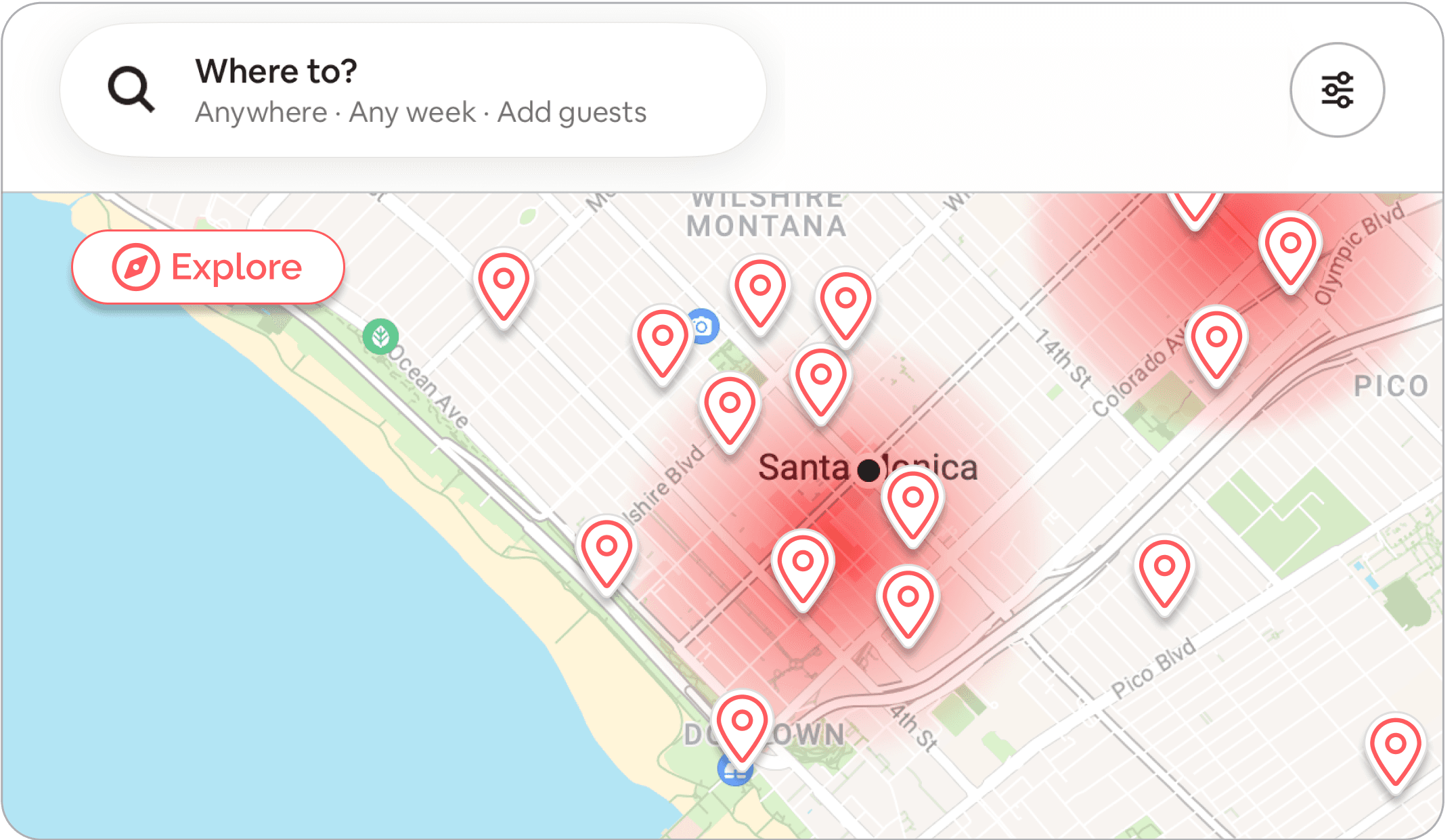
Explorer Mode
Discover key attractions and insights at a glance with an intuitive, map-integrated exploration tool.
Based on user research and pain points, I chose approach 3 ‘Explorer Mode’ to meet our users' varied needs, from planners to explorers. This feature uses a heat map to show the density of local insights along with preview cards to browse images of the location.
APP AUDIT
The Airbnb map feature is limited.
Before starting my design process, I reviewed Airbnb's map feature and identified shortcomings such as the non-interactive interface and scarce information, making it hard for users to find suitable accommodations.

PRODUCT USER TESTING
Gaining feedback from the community.
To refine and improve the design, I conducted user testing with 5 participants, resulting in three key findings:
FINDING 1
Red is often associated with danger, suggesting a need for a more intuitive gradient.
FINDING 2
The abundance of pins on the map made it hard to focus on specific interests like safety or food.
FINDING 3
Without real-time information or information about the distance from and to restaurants and attractions, users felt that the information was unreliable and out of date.
FINAL SOLUTIONS
Key Features of 'Explorer Mode'
Based on these findings, I created product solutions specific to the pain points found during the user testing.
FEATURE 01
Local Insights Density Heatmap
This feature displays a heatmap of local attractions and eateries, guiding users to high-density neighborhoods for deeper exploration and informed stay decisions.
FEATURE 02
Insight Type Filter Categories
Introducing distinct categories such as dining, transportation, attractions, and safety to facilitate targeted and a visually simple interface.
FEATURE 02
Live Data and Navigational Map Directions
Enhanced exploration by integrating live crowd level data and providing mapped directions to each location.
MEASURING SUCCESS
Measuring results through ‘Explorer Mode’
Although I do not work at Airbnb and may lack some product insight, I'm confident this idea could succeed with proper validation and iteration.
Success metrics could include:
# of bookings made directly from 'explorer mode' map interactions
# of users retained comparing ‘explorer mode’ users vs. non-map users
# of hours users spend using the map feature with ‘explorer mode’ compared to previous levels
REFLECTION
Measuring results through ‘Explorer Mode’
As an active user of airbnb, there were many features I wanted to explore and address inspired by my travels in Southeast Asia. But ultimately I had to scope it down to one problem to dive deeper on. This study was the result of multiple rounds of problem definition and scoping of issues. Overall, the process was both rewarding and personally meaningful.
For next time…
Improve ‘Explorer Mode’ search and discovery with themed filters.
Enable offline map access for seamless navigation without internet.
Promote sustainable travel by highlighting eco-friendly options.
Moving forward…
My focus is on continuous improvement—gathering feedback, refining the solution, and exploring new enhancements to better the Airbnb experience, making every travel experience memorable.
Travel Bucket List

Great Barrier Reef in Australia

Northern Lights in Iceland

Surfing in Fiji Islands